I think the good and strong parts of my logo is the overall idea. I think the I achieved the goal for the project.
I dont like my colors they dont match the school very well.
mail and anchor was my theme because it involoved mail and the school slogan.
Catchy and simple, because they are unique and easy to identify.
I conclude that logo design takes a lot of thought.
I learned there are many things to consider to make a good logo. These include color size and shape.
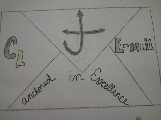
This is my final logo design
This project was done to make logo designs for the clear lake e-mail. I did many designs, but I still tried to keep the theme of Anchored in Excellence. This project was set up as contest between all of the intro classes to see who could come up with best logo design.The winner would be used on the website. In the end there were many great logos so not one in particular one won the contest. The conclusion to this was that all of the logos would be rotated at different times on the website.
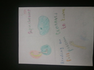
this is my preiminary
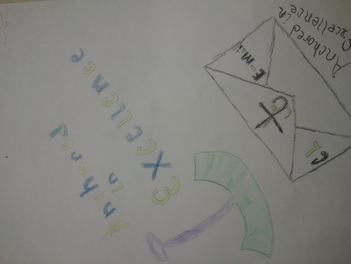
This is my exceeding logo design

this is my preliminary
